01
Two different disciplines, one experience.
UX (user experience) design determines who a product exists for, what problem it solves, and through which steps that solution is reached. Research, information architecture, user flows, and usability testing are the tools of this discipline. UI (user interface) design is where these decisions become visible and tangible: color, typography, button states, micro-interactions.
Separating the two is useful for teaching, but in real work they're inseparable. An interface that looks flawless but leaves users unable to find what they need is a UI success and a UX failure; a design with the right flow but no sense of trust is the reverse. A good product requires both to be right at the same time.
02
Structure first, screens second.
The UX process doesn't start with a screen — it starts with questions: what is the user trying to do here, what information do they need first, which step creates unnecessary friction? The answers to these questions build the information architecture — the skeleton that determines which content sits where, and in what hierarchy.
Once the information architecture is clear, user flows and low-fidelity wireframes come into play. At this stage there's no color or typography yet — the only question is whether the flow makes sense. Testing is cheap at this point — moving a box costs far less than recoding a fully developed screen from scratch.
03
Consistency comes from a system, not individual screens.
UI design isn't about dressing a wireframe in visual language — it's an engineering discipline in its own right. A button isn't designed just once — it's designed together with its normal, hover, pressed, disabled, and loading states. When any of these states is missing, the user loses the ability to "talk" to the interface.
That's why mature UI work produces a component library, not individual screens: reusable cards, form fields, badges, spacing rules. Light/dark theme support in DMU's own interfaces is likewise a result of this systematic approach — a single component set that stays consistent under two different lighting conditions.
04
Accessibility isn't a layer added afterward.
Sufficient color contrast, readable type sizes, touch targets that are comfortable to tap, and labeling compatible with screen readers — all of this is the design itself, not a layer bolted on later as an "accessibility update." For a user with low vision, insufficient contrast is just as real a barrier as a tiny tap target is for a user with limited motor skills.
These principles also create a better experience for everyone: high contrast stays readable in sunlight, and generous tap targets don't punish a user on the move. Accessibility means designing for the full range of real-world conditions, not for a narrow slice of users.
05
Process is proof, not a claim.
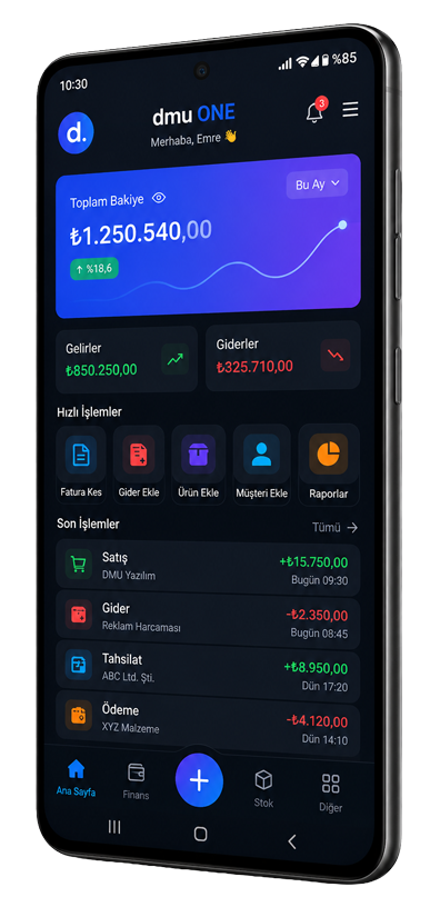
Unifying 13 business domains and 67 functions into a single mobile app was not a theoretical UX exercise — it was a real problem that demanded research, information architecture, prototyping, usability testing, and repeated iteration. dmu ONE is the output of that process, and the most honest way to describe DMU's UI/UX approach is to show it directly.
Mobile App Development: Custom mobile apps that scale with your module count