01
It's a discipline far broader than the logo.
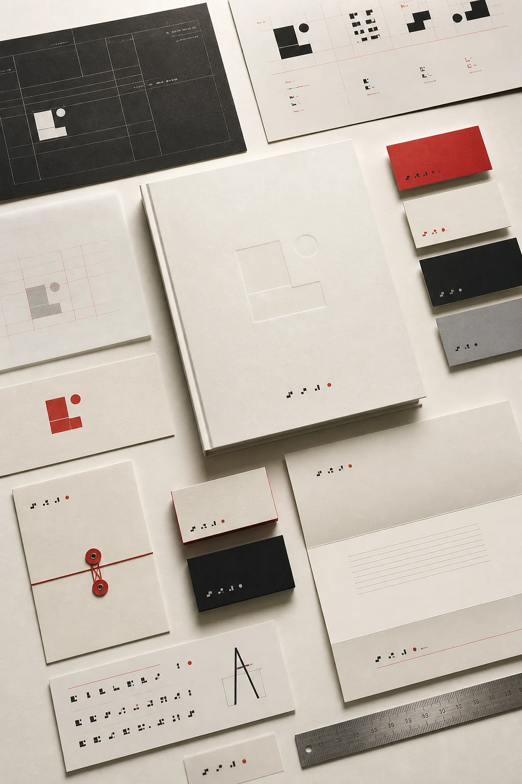
Graphic design is usually equated with the logo, yet the logo is only one output of this discipline. Graphic design is a broad field of application covering a brand's print materials, digital interfaces, packaging, signage, social media visuals and much more.
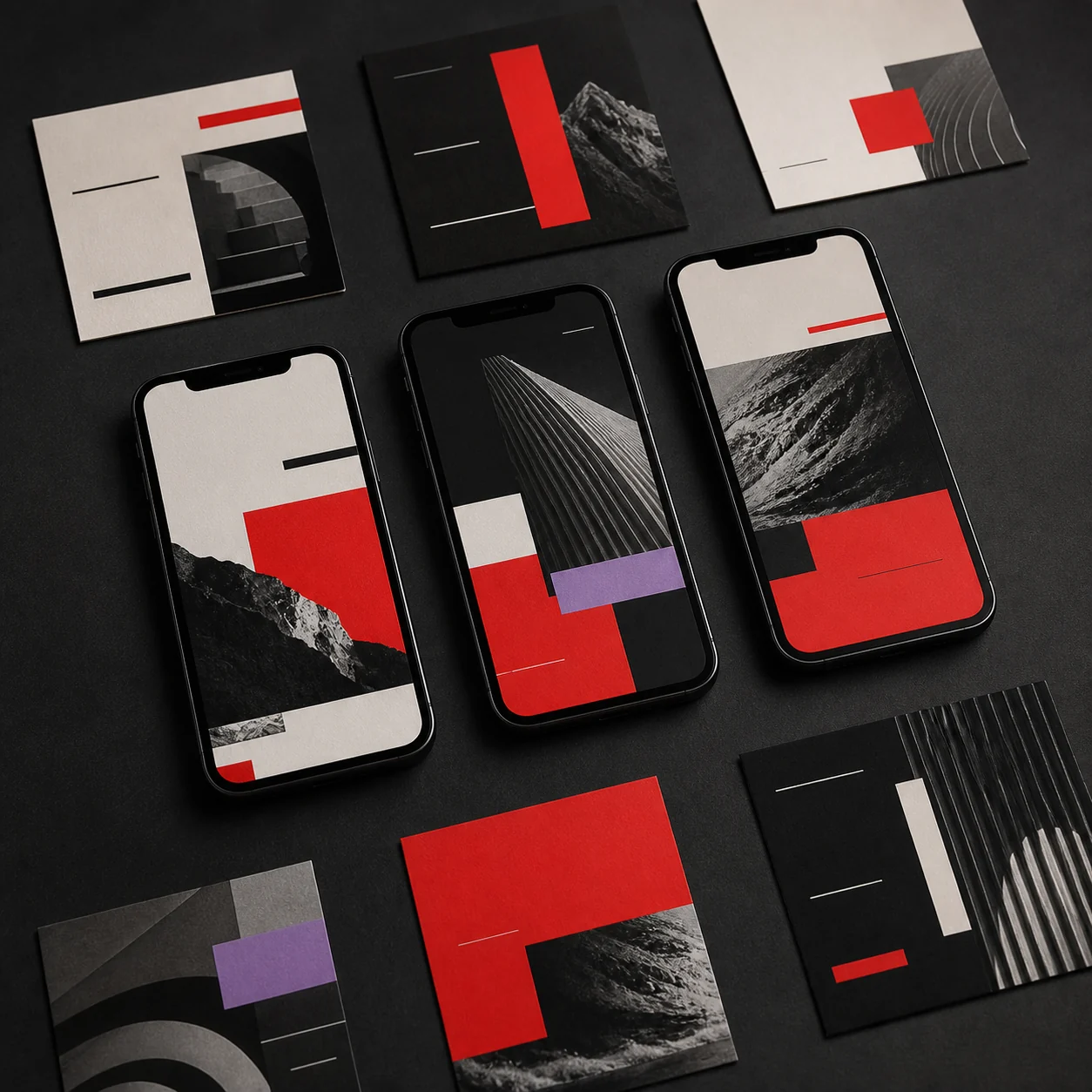
Each of these works by its own rules, yet all of them draw on the same visual language. A business card and a social media post should feel, at first glance, like they belong to the same brand — and that's precisely what graphic design delivers.
02
The eye follows the path the designer has drawn.
Visual hierarchy is the ordering of elements in a composition by importance, through size, position, contrast and color. In a well-built hierarchy, the eye goes first to the most important message, then works its way down through the rest of the information.
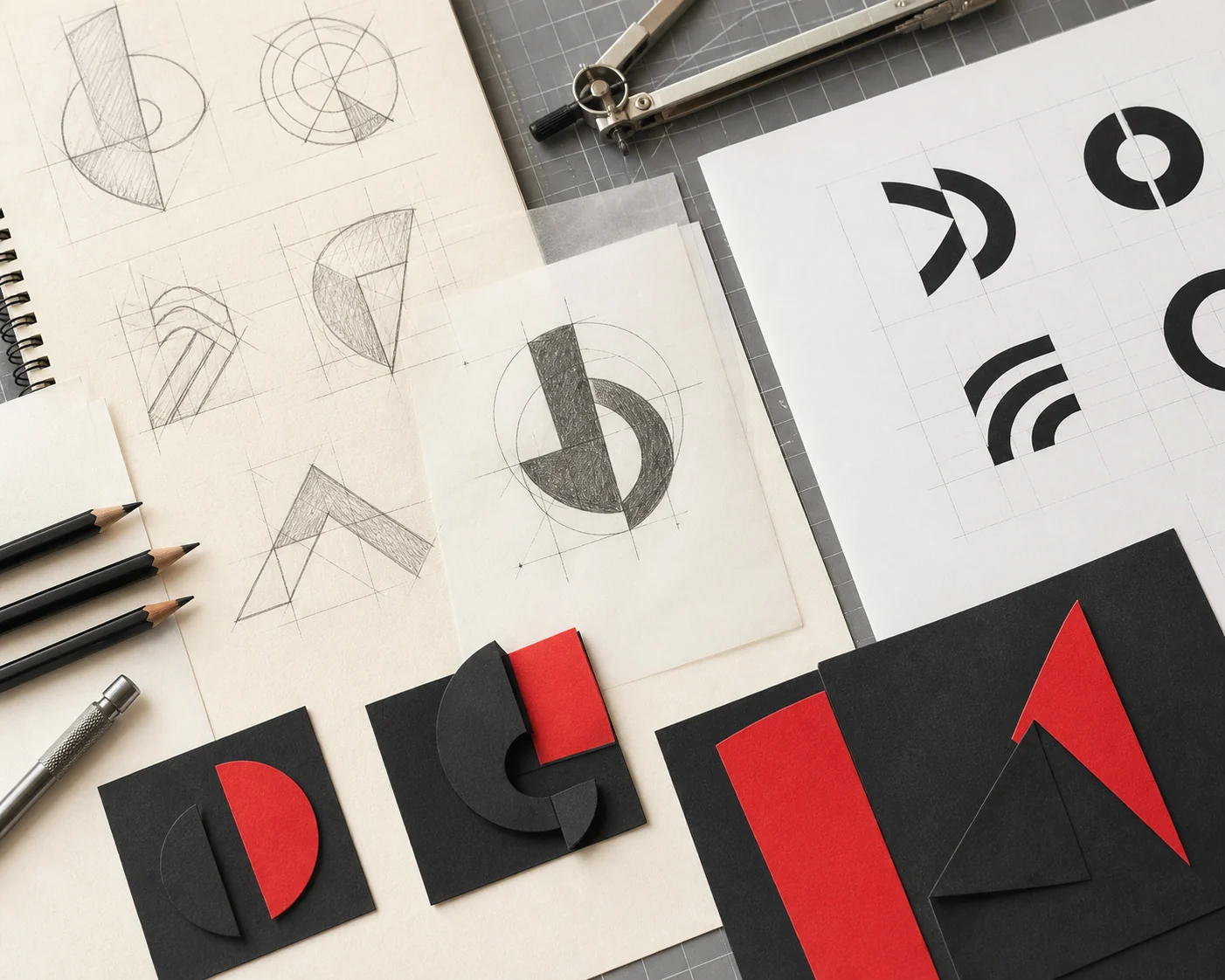
The infrastructure behind this is the grid system. A grid is the invisible scaffolding every element on a page aligns to; when column and spacing ratios stay consistent, a design feels ordered and trustworthy rather than chaotic. Designs produced without a grid tend to leave a sense that "something's missing," because the eye never knows where to look.
03
Color and typography speak without saying a word.
Color theory determines the emotion a design conveys in the very first second it's seen. Warm colors communicate energy and urgency, while cool colors convey trust and calm; contrast ratios, in turn, directly affect legibility.
Typography pairing plays a similar role: the weight, width and character differences between the fonts chosen for headline and body text decide whether a page reads as careless or considered. Rather than placing two fonts side by side at random, you need a clear contrast between them — one should speak while the other listens.
04
Every surface works in its own language.
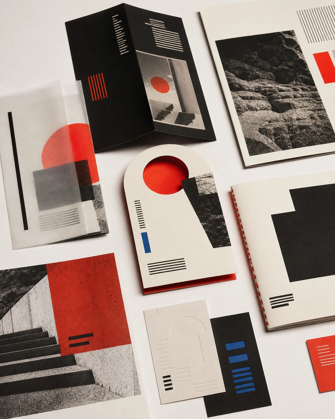
Print design works within the limits of paper texture, print color (CMYK) and physical dimensions — a poster, a brochure or a business card depends on details, such as bleed and color profile, that will never appear on a screen. Digital design, in turn, is built around screen sizes, the RGB color space and interaction.
Packaging design demands three-dimensional thinking, while signage must stay legible from a distance and in motion; social media visuals, meanwhile, have only seconds to catch attention. Because these requirements differ so much, adapting a single visual to fit everywhere simply doesn't work — every medium has to be redesigned by its own rules.
05
A design system isn't a one-off job — it's infrastructure.
For graphic design to be sustainable, what's needed isn't a pile of individual files but a system: color palettes, typography rules, grid ratios, icon style and photography approach all need to live in a single guide. Without this system, every new piece gets designed from scratch, and the brand gradually loses its consistency.
We apply this in our own work, too: DMU's brand identity work is the reference point for our graphic design decisions. If you'd like a closer look at our identity system and brand guide, you can explore it as an in-depth example.
06
The right graphic design keeps your brand consistent on every surface.
If you want every one of your materials — from print to digital, from packaging to social media — to draw on the same system, you can start with our core brand system.
Explore our ready-made brand identity package